 Netcall Spark design system 04 / 04
 What happens when Spark has no shared components?
Spark Design System gave the team a shared foundation for the controls they use every day — from Figma patterns and Tailwind variables to tested Vue components in Storybook. The system was built iteratively, starting with what Spark already used and refining it with the people shipping it.
Spark Design System
built in layers.
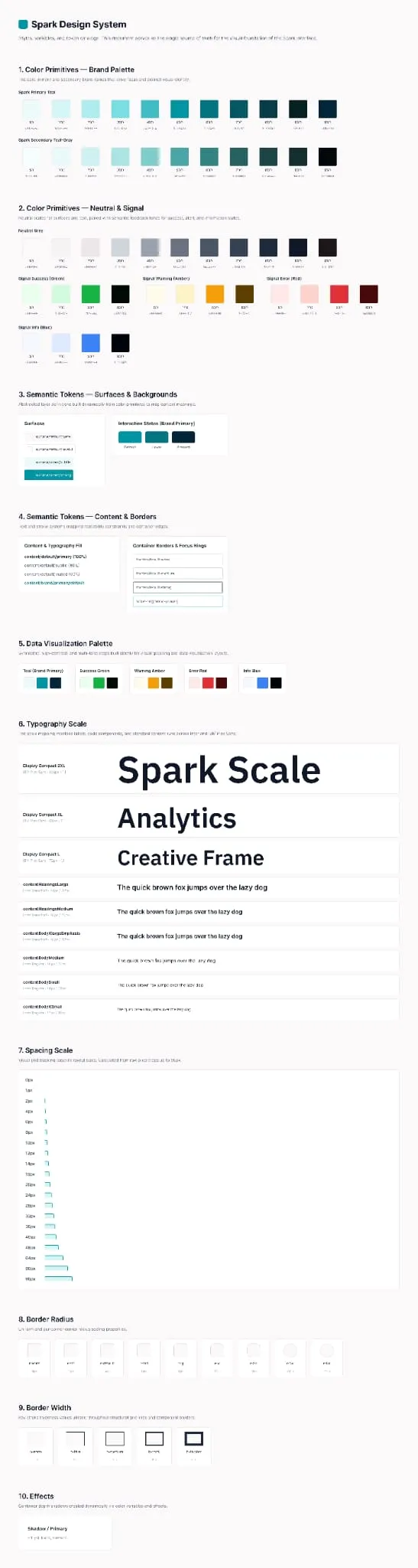
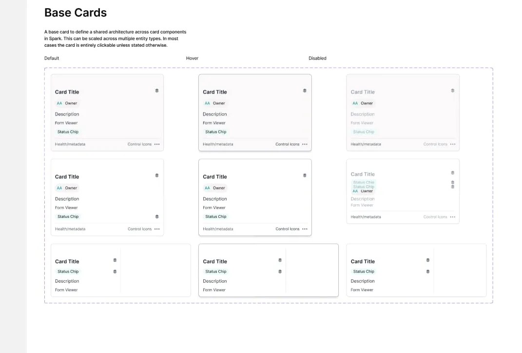
Spark was built in layers: shared foundations such as colour, type and spacing; reusable components built from them; and patterns that bring those components together in real product flows. Each layer gives the next a clearer starting point, while leaving room to refine the system as Spark evolves.
No Design System. No Source Of Truth.
Spark had grown through many local decisions: inconsistent front-end patterns, no dependable component record and no library of real components to build from. Other Netcall teams had embryonic design systems of their own, but Spark could lead a more joined-up way of working between design and front-end development. The task was to understand what existed, define the common controls, and create a component library the team could trust and reuse.
No Shared Inventory
There was no reliable record of the components already in use, so the team repeatedly recreated buttons, inputs and cards.
Repeated Components, Endless Names
Similar controls were named and implemented differently across Spark, making them hard to find, compare or reuse.
Decisions Without Guidance
Without shared strategy or production components, design and engineering decisions were made screen by screen — including accessibility.
 — view full size
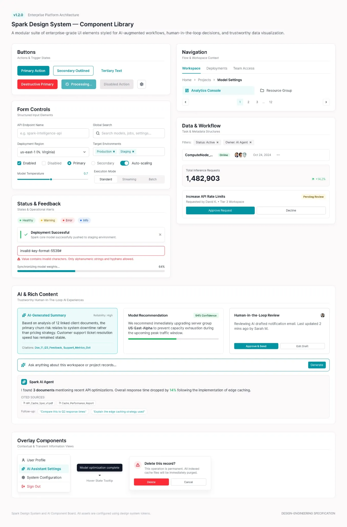
 Buttons and form controls — the primitives every other pattern is assembled from.
Tabs, breadcrumbs and pagination, then the task rows and approval actions built on top of them.
Status chips, alerts, validation and progress — how Spark says what just happened.
Generated summaries, confidence and citations, and a human-in-the-loop review step.
A working inventory of the component families Spark needed most. The work started with the shared controls the team and Spark users encountered every day. Hover the markers.
Accessibility no longer
an afterthought
Spark started with the CTAs, buttons and controls people use every day. Each was mapped in the states and contexts it needed to support, then refined with the team building Spark.
That made accessibility part of the work, not an afterthought. Contrast, focus, keyboard behaviour and clear error feedback were designed into the component as it was made — not added once it had already spread across the product.
- surface/default/base
- border/default/strong
- content/default/primary
- surface/brand/strong
- surface/brand/base not for a filled label
Field text on surface/default/base
Button label on surface/brand/strong
Ruled out — button label on surface/brand/base
A filled button takes the strong step of the brand ramp, not the base step, because the base step carries white at 3.43:1. The team never has to weigh that choice again. They ask for a primary button.
- surface/default/hover
- border/default/strong
- surface/brand/strong-hover
Button label on surface/brand/strong-hover
Hover only ever moves down the same ramp, so a hovered control can never end up lighter than the one beside it. It also never carries meaning on its own: there is no hover on a touch device and none for a keyboard, so anything only hover says is unsaid for them.
- focus/ring/brand
- focus/ring/offset
- border/default/strong
Focus ring on surface/default/base
Two pixels of ring, two of offset, drawn outside the border so it survives a dense form. One token, applied by the component, is the whole reason a keyboard user gets the same ring on a chip, a card and a select.
Use letters, numbers and hyphens only.
- surface/danger/subtle
- border/danger/strong
- content/danger/default
Error message on surface/danger/subtle
Red is never the only carrier. The state ships with an icon and a sentence naming what to change, and that pairing lives in the component, so a screen in a hurry cannot drop half of it.
Locked while this workflow is running. Stop it to edit.
- surface/default/disabled
- border/default/subtle
- content/default/disabled
Disabled label on surface/default/disabled
The one pairing here that misses 4.5:1, and the only one WCAG exempts. The system fills the gap with its own rule instead: a disabled control always renders the reason it is disabled as ordinary text beside it.
A static recreation of the states, so nothing here takes focus away from the page. Every ratio is the computed WCAG value for the two colours the panel beside it actually paints.
Semantic colour tokens
Surfaces and interaction states
Colour primitives are named by purpose, so the system can express context consistently across product screens and component states.
Surfaces
Interaction States (Brand Primary)
These names describe purpose rather than a raw colour value — surface/brand/strong, not teal-700 — making decisions easier to find, discuss and refine without changing every screen that uses them.
A System That Can
Evolve With Spark
Spark was never a one-off handover. It was an iterative process: understand Spark, build the common parts, then use real work to find the gaps, edge cases and repeated components worth bringing back into the system.
Naming conventions made the shared parts easier to find and discuss. Storybook made the coded components visible and testable. Together, they gave design and engineering a common place to decide whether a pattern should be reused, extended or retired.
The practical trade-off was progress versus safety. We identified what could be refactored without disrupting Spark, and what needed to wait. That let the system improve day-to-day work without asking the team to pause and rebuild everything at once.
- The shared states and behaviours of core controls
- Accessibility requirements: focus, keyboard behaviour and contrast
- Component names and usage guidance
- The tested Vue component the team can reuse
Change it here and the whole Spark experience inherits the improvement.
- Workflow-specific layout and composition
- Edge cases and new states found in Spark
- Which existing components to consolidate or extend
- What can be safely refactored now, and what must wait
The system evolves as new work exposes real gaps and edge cases.
A component per feature
The quickest route in the moment, and the one already causing drift. It loses a shared vocabulary, repeats decisions and leaves no single place to improve an accessibility defect.
Tokens without components
Foundations alone would have documented the system, not made it usable. The coded component is where decisions become something the team can test, trust and reuse.
A single big-bang migration
Replacing everything at once would have stalled product work and made safe refactoring harder. Spark instead grew through progressive adoption: improve the common controls first, then refine and consolidate over time.
One System,
In Use
The Figma design system established the shared patterns and foundations. Tailwind variables carried those decisions into implementation, while the Vue component library in Storybook became the coded source of truth for trying, testing and reusing them.
This was more than a hand-off. Components could be tested with realistic Spark data, pushed through awkward states and improved before they were reused in more product work. The same names, states and usage guidance travelled from design into code.
Interactive specimen
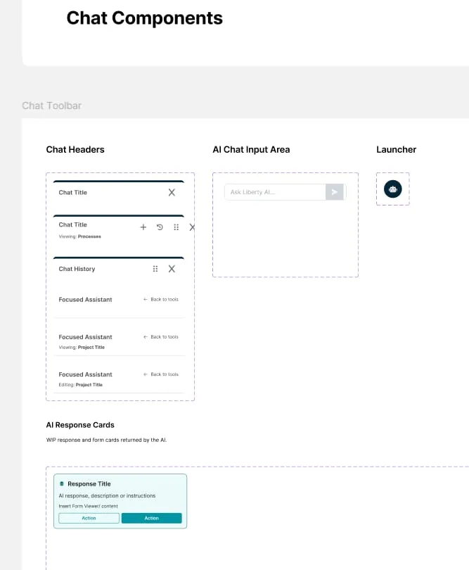
A working recreation of the Form Controls pattern from the SPARK component library. The controls use native behaviours, focus states and labels.
The coded controls the system supplies: native inputs, real labels and real focus behaviour. This is where the team could test a component against realistic Spark data before making it part of another workflow.
 — view full size
 AI was useful only when it strengthened the system, not when it created another one.
Claude was explored as part of the component workflow: challenging new and existing Vue components, surfacing inconsistent behaviours and helping the team think through states to test. Storybook remained the code source of truth, where components could be pushed with realistic Spark data rather than judged from a static design alone.
Consistency Is
the Result
A design system earns its value through adoption and consistency: whether the team uses the shared components, whether new duplicates stop appearing, and whether everyday controls become clearer and more effective for the people using Spark.
Where I’d Start
These outcomes were not formally measured. They are the first signals I would track as Spark Design System matures and the team adopts it.
Screens built from the library
Share of new screens using shared components rather than beginning again with one-off controls.
Duplicate components prevented
Whether new components stop appearing outside the library, and whether existing duplicates can be safely consolidated.
From pattern to tested component
The time it takes to move a shared pattern from Figma into a tested Vue component with realistic Spark data.
Accessibility defects prevented early
Whether contrast, focus and keyboard issues are resolved in the shared component rather than discovered later in a screen review.